
Waiting weeks for your photos is like waiting for a letter by carrier pigeon in today’s world. It’s slow and outdated.
Photographers often disappear for hours, talking about “queues” and “head swaps.” A single family session can take 4-6 hours of editing time. That’s a whole day lost to editing.
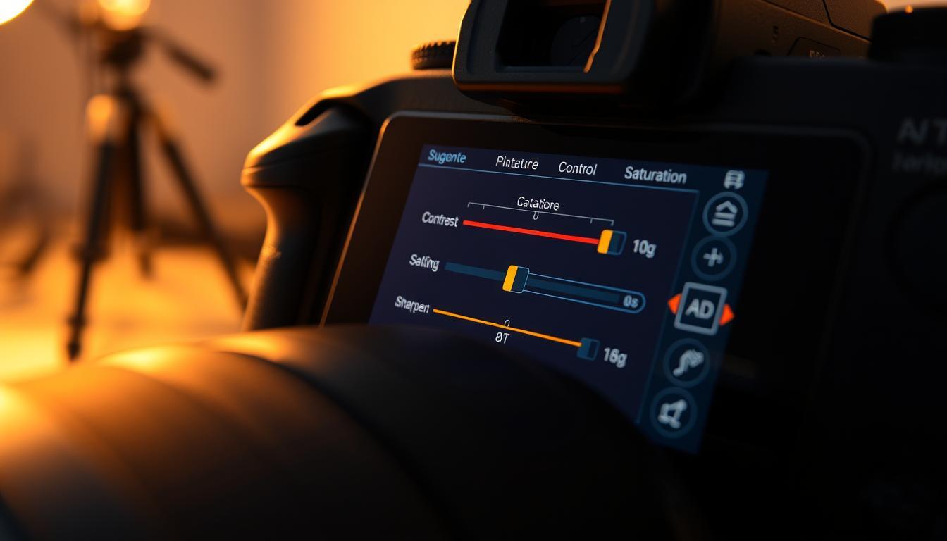
What if you could add your signature look before taking the photo? This is where picture control makes a big difference.
It’s like using pre-mixed spice rubs in cooking. Instead of raw, flavorless files, you get almost-finished dishes straight from the camera.
This isn’t about sacrificing quality. It’s about being smart and efficient. It’s like building IKEA furniture with a power drill instead of an Allen key. You get the same result but faster.
Learning to use your camera’s light settings means a quicker, smarter workflow. Your clients get their photos faster, not stuck in your editing queue.
What Profiles Do
Every JPEG or video file from your camera is a carefully crafted lie. It’s a beautiful one, thanks to a set of instructions called a profile. Think of it as your camera’s art director. Before you even snap a photo, it’s already deciding on color, mood, and contrast.
A Picture Profile, or what Canon calls Picture Style and Nikon calls Picture Control, is a predefined set of processing rules. It tells the sensor’s raw data how to become a finished image. This is the heart of in-camera processing.
Remember the basic editing steps? White balance, exposure, contrast, clarity, sharpening? A color profile handles the first four with precision. It applies a specific color science, contrast curve, and saturation level. Sharpening is often a final step. The goal is to do most of the work at capture, not later.
Why does this matter for speed? It’s because all digital images need interpretation. Film needed development; digital files need processing. You can either process them later on your computer or let the camera start. Using profiles is like marinating your ingredients before cooking—the flavor is set from the start.
Different profiles create vastly different looks. Your choice sets the entire tone of the shoot.
| Profile Type | Color Science | Contrast & Clarity | Best For |
|---|---|---|---|
| Neutral / Faithful | Accurate, muted | Low | Documentary work, skin tones, maximum editing flexibility |
| Vivid / Standard | Boosted saturation | High | Landscapes, product shots, instant social media appeal |
| Portrait | Warm, flattering tones | Moderate | People photography, reducing post-production skin retouching |
| Monochrome | Black & white filters | Variable | Artistic shots, highlighting texture and form |
This isn’t cheating. It’s smart efficiency. The “Two Minute Rule” from efficient workflows applies here. If you can decide on a look in two minutes in-camera, you save twenty minutes later trying to recreate it from a flat raw file. A consistent color profile across a shoot gives you uniform assets. This is a game-changer for events or multi-shooter projects.
In short, profiles don’t just alter colors. They establish a visual language. They are the first and most important step in a fast, repeatable workflow. You’re not getting it “right in-camera” in the purist sense. You’re getting it consistently and efficiently in-camera, which is far more valuable.
Neutral vs. Vivid for Uniform Accuracy
Think of your camera’s picture profile as a political party platform. One promises raw, unvarnished truth, the other a more perfect, colorful union. It’s not just a menu setting. It’s a foundational declaration of intent before you even press the shutter.
The Neutral profile is your internal archivist. It aims for maximum tonal information and color fidelity. It holds highlights and shadows in a trust fund for later withdrawal. This creates a uniform, accurate data set, a blank canvas.
It’s essential for projects demanding color consistency—think a wedding with mixed lighting or a product catalog shot across multiple days.
Vivid, on the other hand, is your in-house editorial board. It boosts saturation, cranks contrast, and almost always applies a dose of in-camera sharpening to make edges pop. It delivers the “missing punch” right out of the gate.
This profile is for the finisher, not the archivist. If you’re delivering images straight to a client’s social feed or need crisp action shots for immediate league use, Vivid can be your finish line.
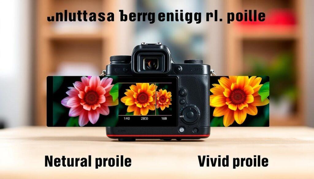
So, which is “accurate”? Your sensor doesn’t see the world; it records data. A profile is your camera’s opinion on what that data should look like. Neutral offers a clinical baseline, making white balance correction a straightforward fix for color casts.
Vivid states its editorial bias upfront—it’s already done the creative “push.”
The choice boils down to workflow and tolerance. A Neutral profile is a safety net for complex color grading or matching bodies across a team of shooters. A Vivid profile trades some flexibility for immediate impact and that extra bite of sharpening.
One isn’t morally superior to the other. Choosing Vivid isn’t lying; it’s choosing to be a columnist instead of a stenographer from the very first frame.
In‑Camera Sharpening/NR Settings and Matching Bodies Across Shooters
The final layer of in-camera alchemy isn’t about color—it’s about texture. Sharpening and noise reduction are key. Get them wrong, and your images suffer.
In-camera sharpening is a permanent choice. Too much makes images harsh. Too little makes them soft. A light touch is best.
Noise Reduction, or NR, is also tricky. Too much hides grain but loses detail. It’s like overexposing film, making images look plastic. A gentle NR setting keeps images natural.
Standardizing camera settings is powerful. When all cameras are set the same, consistency is easy. This is how studios achieve a unified look.
A second shooter’s files match the lead’s perfectly. Post-production becomes about checking quality, not changing everything.
Systems like Nikon’s Picture Control make standardization simple. Save your settings as a preset. Load it on every Z8 and Z9. Your brand’s look is now portable and repeatable.